Rugged Rocks
One thing that bugs me is a tilted horizon and this has one. Image appears to be a tad bit underexposed (dark) and could possibly use some post work in the shadows to bring out that detail. Those are the technical things I see.
From a composition perspective, the tire tracks can either hurt or help. Are they part of the story - leading to nowhere, leading to the rock. Or are they just there 'cause you were lazy to walk out and take the picture?

I do like the big old rock and black sands, but I'm wanting more.
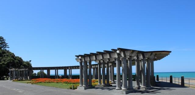
Columns and Sky
I like what you were trying to do here with the leading lines. Yet the right side sort of falls off for me. It's empty. I think it would work if there were more on the right side or less, but this seems to be in no-mans-land. I like the colors and exposure from a technical perspective.
What I try to do when I cull/submit is ask myself would I want to print that 20x30 and hang it on a wall? If the answer is no, then it's in the snapshot bucket in my head. But if I do want to print it and hang it, then I'll look for opinions much like you are asking. Does that help?
Edit To Add:
If you can, try to source a free on-line host of your images and link them back to here. Looking as small attachments isn't the same as looking at a good sized version of the image lime most of us do in this little corner of TWT. Freebies include Flickr and Photobucket. Paid for places would include SmugMug, Zenfolio.
.


 Feel free to hang out and lurk as long as you like. However, we would like to encourage you to